
What did 30 million people say when they looked inside a fridge? No, this isn’t the setup for a bad joke.
The contents of Americans’ fridges was just one of the diverse data sets multi-award-winning journalist Amanda Cox took us through as part of her masterclass on interactive storytelling at our client event at the end of January.
In a world filled with noise, making important stories stand out is more challenging than ever – for world-leading journalists and for marketers.
Drawing on her 17-year tenure at the New York Times, Amanda showed us how to bring complex issues (and often strange data sets) to life to make stories stand out.
Interactive storytelling, she said, is about giving people a guided tour through data, images and the written word. Plenty of inspiration and practical tips for anybody looking to engage and captivate intelligent audiences. Here are our key takeaways.
1. Bend toward each other
Successfully blending words and visuals requires people with different skillsets. As Amanda put it ‘people who paint in words’ and ‘people who paint in pictures’. No one gets to create exactly what they want. Instead, they must bend towards each other, making compromises to shape one, cohesive piece. Unlike the newsroom where one person typically takes the lead, with interactive storytelling, gathering information and shaping what it becomes is a collaborative process.
Amanda’s tip: When choosing your project team, build a ‘triangle of strengths’. This includes three roles: the thinker – they bring subject matter knowledge and a vision for the project; the developer – they bring technical expertise; the artist – a bridge between words and data, they bring design skills.
2. Have something to say
To have a strong message requires a clear focus. Choose only one aspect of the data around which to build your story. A clear focus enables you to explore patterns in the data and gives your story a deeper message. This is especially important the more abstract or complex the data set is. Don’t be afraid to cut; it will make your visuals tighter and your story stronger.
Amanda’s tip: Can you articulate your story in a single sentence? If not, it’s probably not worth telling. Just because a data set is interesting, doesn’t mean that there’s a story there.
3. Put the best thing on top
Data visualisation lends itself to stories with complex patterns or a large scale. The visuals and the form they take should showcase what’s unique about the data. So, resist the urge to tell the story chronologically. Instead, lead with the best insight you have.
For example, this New York Times article tells us that most white boys raised in wealthy families will predominantly stay rich or upper middle class as adults, but black boys raised in similarly rich households are much more likely to drop down the socioeconomic ladder.
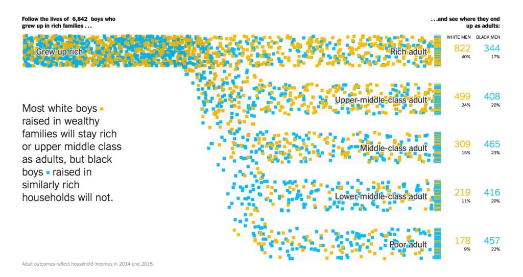
This example uses longitudinal data. Blue and yellow dots represent black and white boys respectively. The way the data is visualised mirrors the income ladder. The impact of the data visualisation is powerful and instant. It tells the story.
Amanda’s tip: Check the mobile display of your story. You may think that a short introduction before the best insight won’t weaken your story. But a quick look on mobile could reveal your mind-blowing data visualisation is the third screen down. Some readers won’t get that far.
4. Interweave words and images
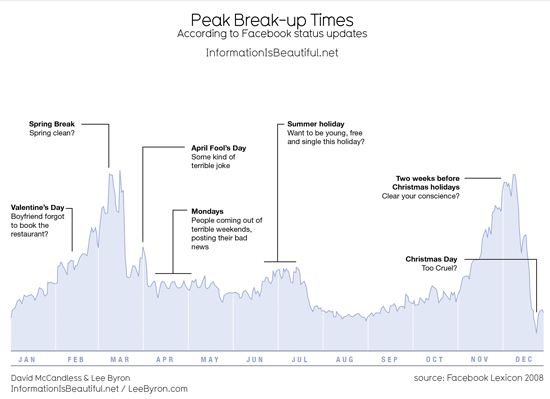
In the same way images guide readers through written words, words signpost them through your data. Use words wisely. Seemingly simple touches, like using verbs in chart titles, bring the reader into the story. It tells them what to do with what they’re seeing. For example, this article about peak break-up times according to Facebook posts uses an active title and an annotation layer to guide the reader.
When you tell readers what’s interesting about the data, they are more likely to spend longer exploring your story and gaining a deeper understanding of the ideas conveyed.
Back to our all-American fridges. This New York Times article asks readers to guess if they are looking at the fridge contents of a Trump or a Biden household. It attracted around 30 million responses.
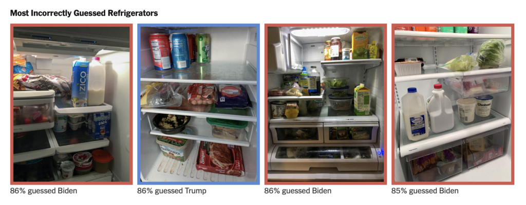
As it happens, people got it wrong as often as they got it right. A big data set (pictures of fridge contents submitted by Trump and Biden supporters) didn’t tell us what we thought it would. You can’t tell a Biden fridge from a Trump fridge. But that’s a powerful insight in itself.
Check out the NYT’s interactive storytelling work here: nytimes.com/international/section/upshot
Follow Amanda’s new mission at USAFacts: usafacts.org
Talk to us about intelligent content and creative storytelling: weareic.com/senior-team/